

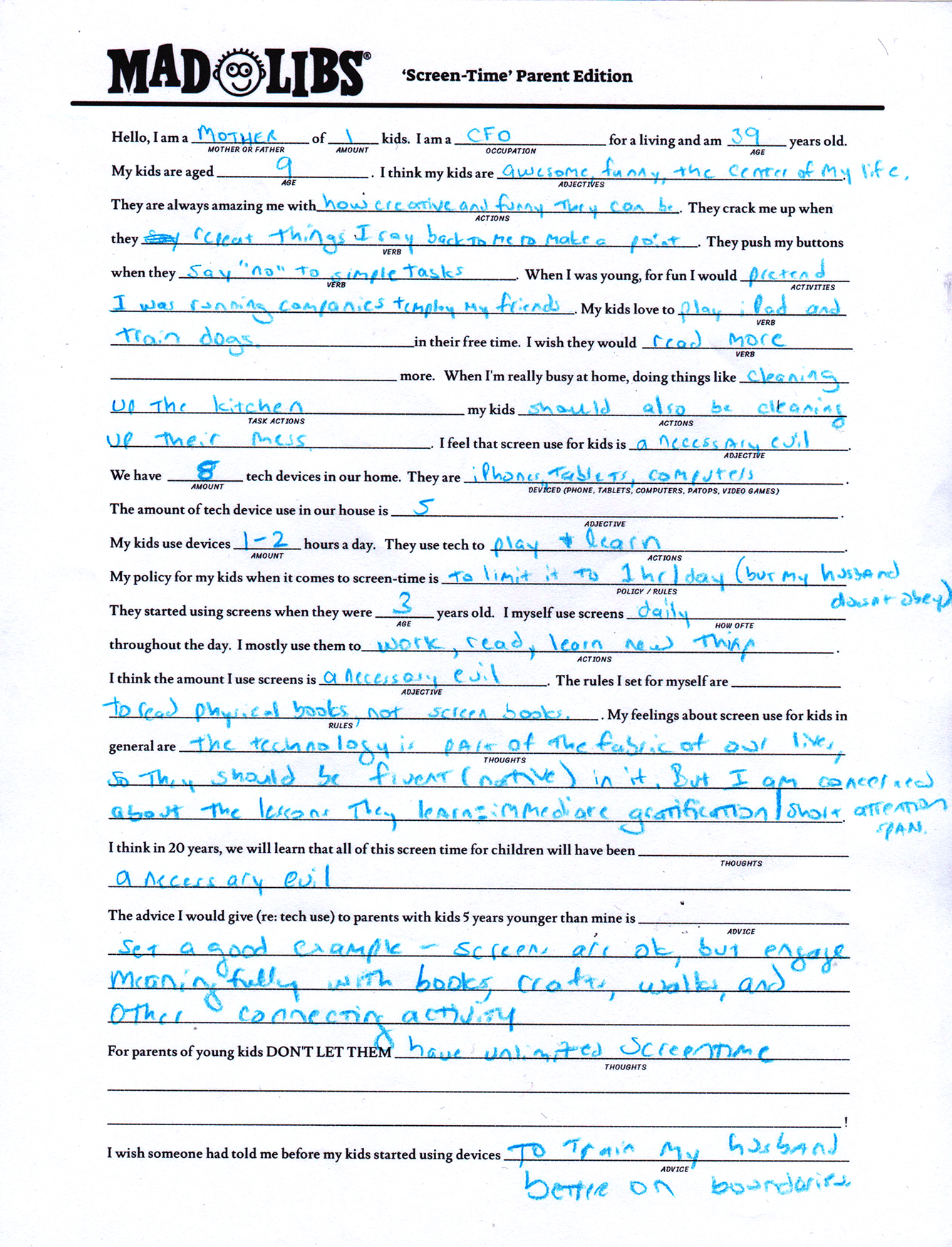
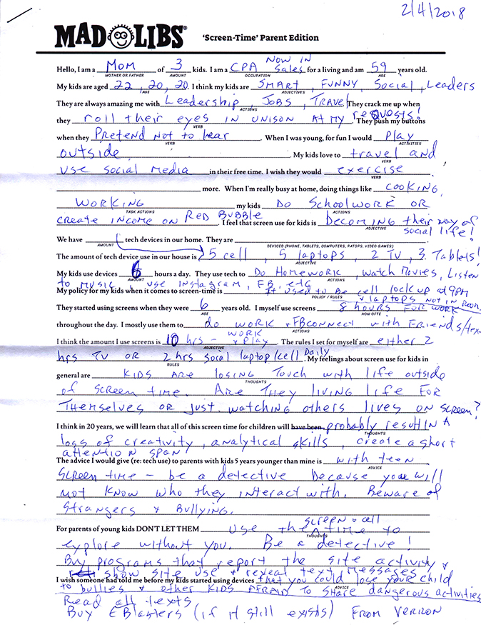
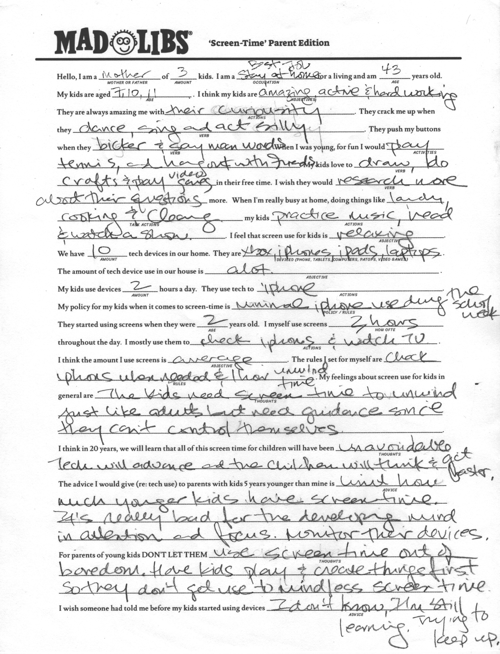
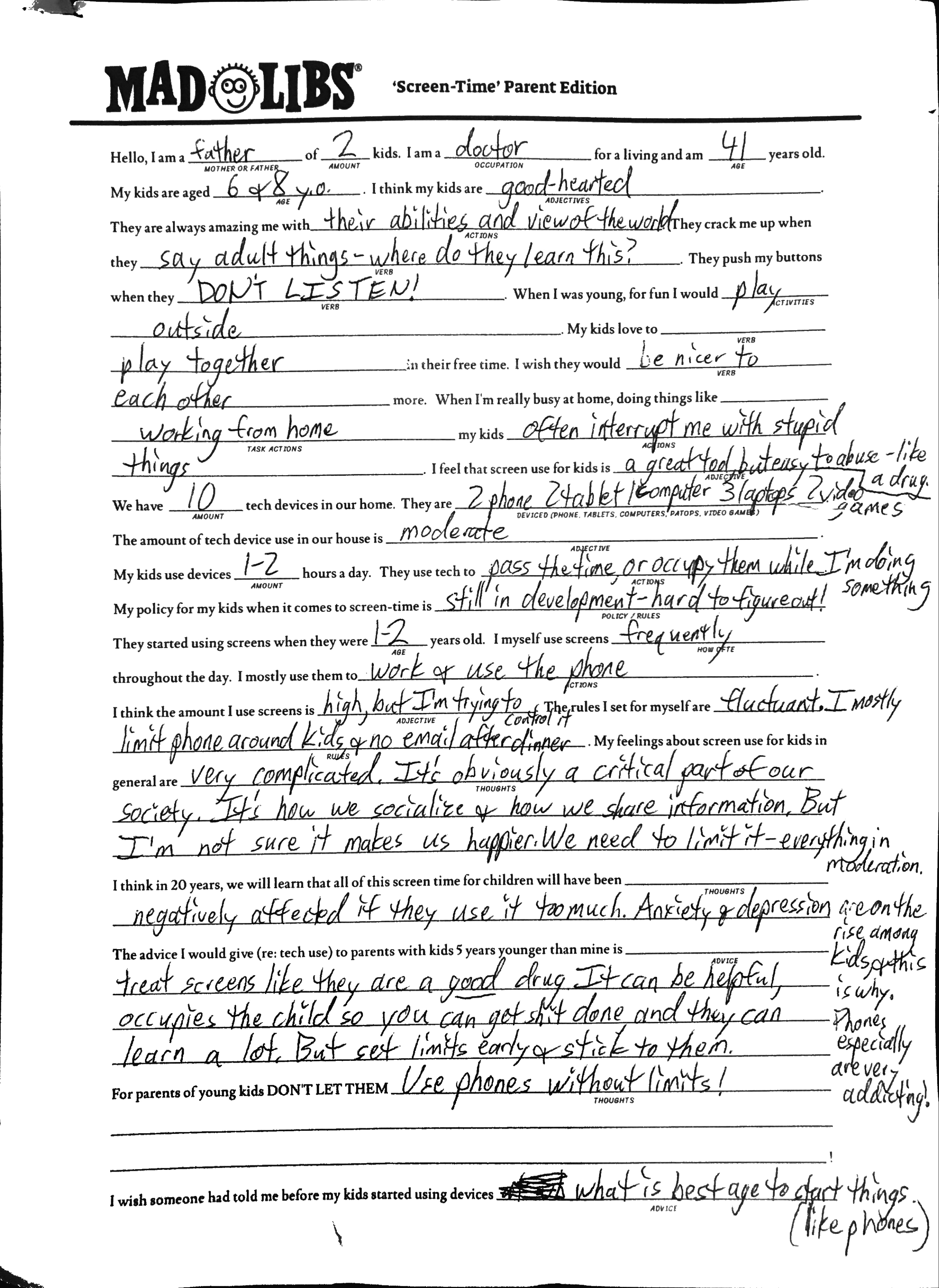
SQUARESPACE
Product Design Internship
Category: Product Design
Roles: UX/UI, user testing, prototyping
During the summer of 2018, I was a summer intern for the product design team at Squarespace. Immersing myself into the Squarespace environment, I learned from a great team and contributed as a generalist for various departments in product design and, in particular, the CMS team.
THINGS I WORKED ON
Analyzing and redesigning the UX/UI of the existing Image Editor to be more congruous with the Squarespace brand and identity.
Working on a new 800px modal system that all of the product design teams could potentially utilize.
Figuring out UX flow for potential Page Settings redesign
Micro-interactions in the Page Badging feature.

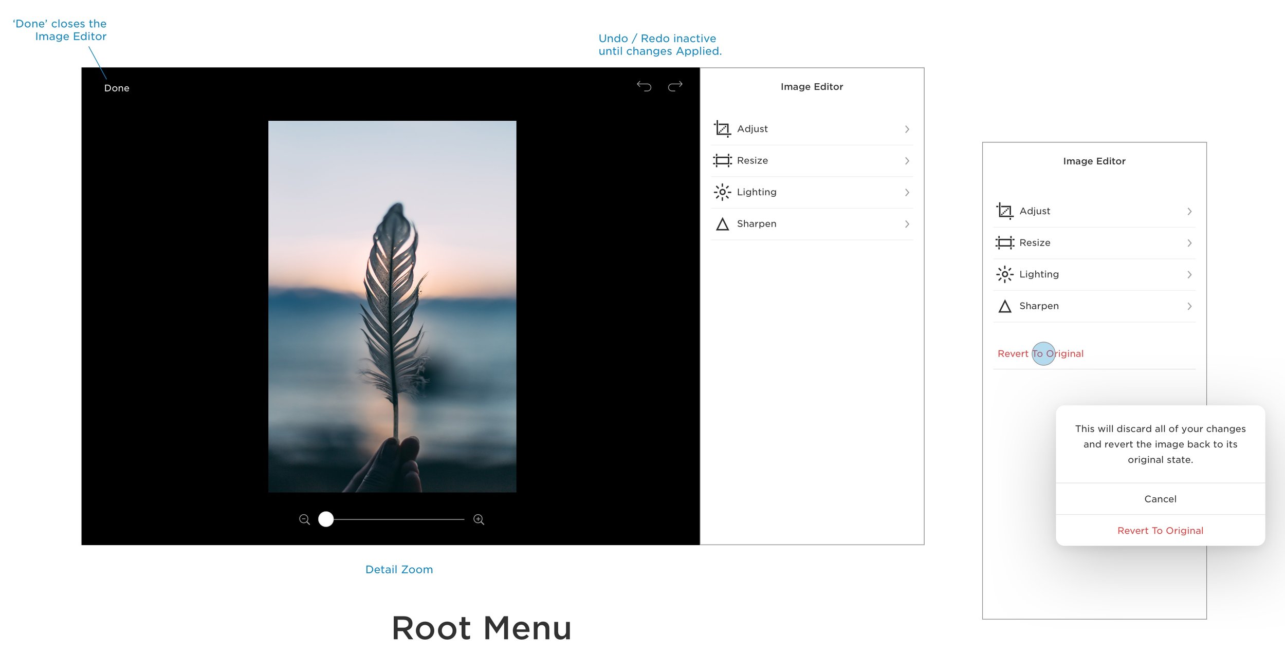
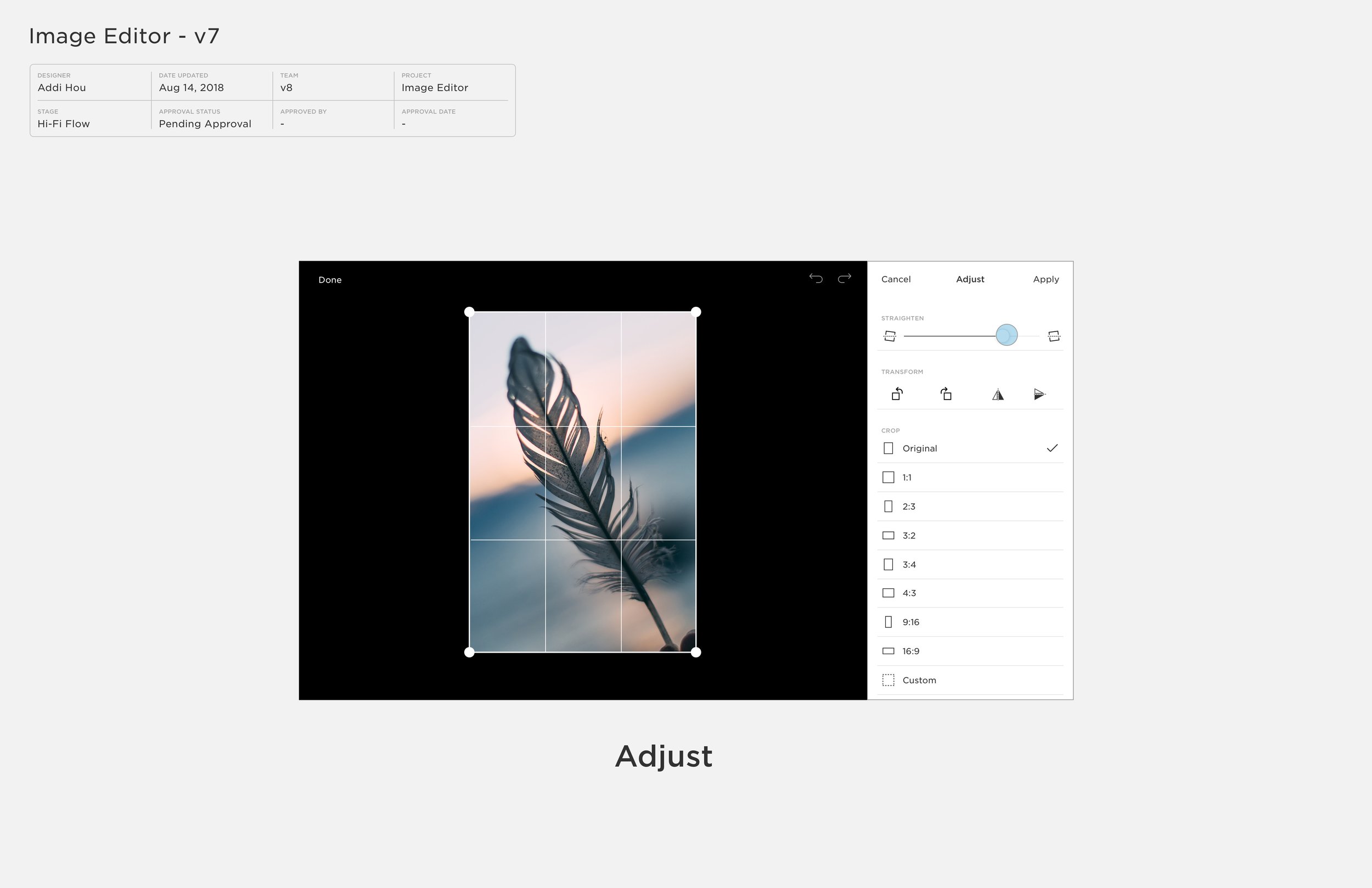
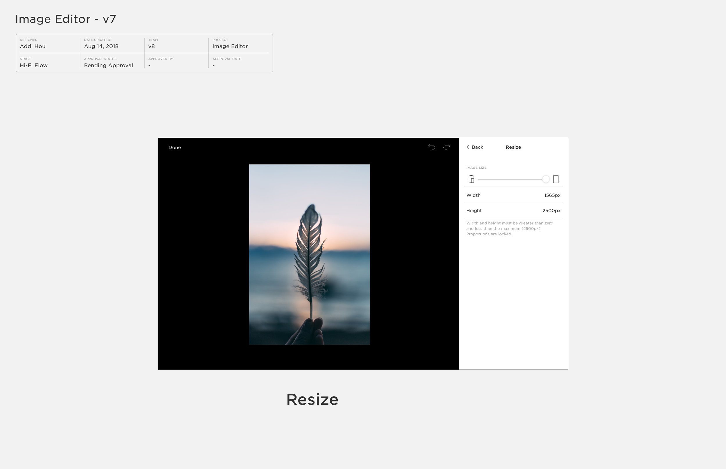
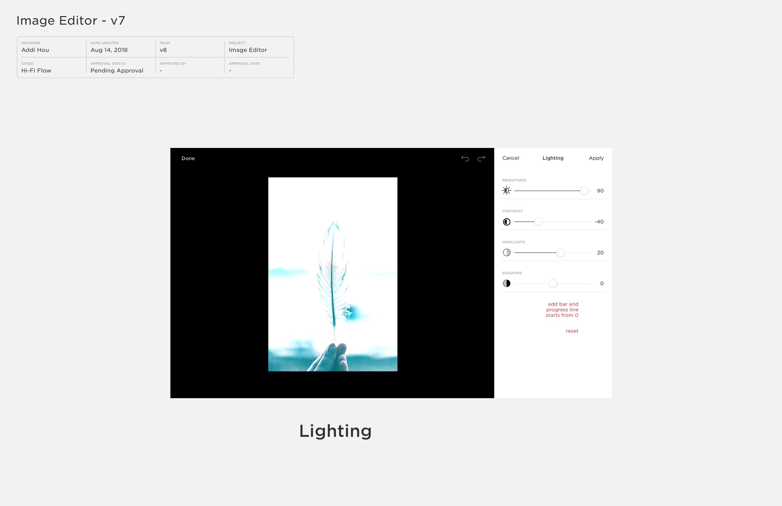
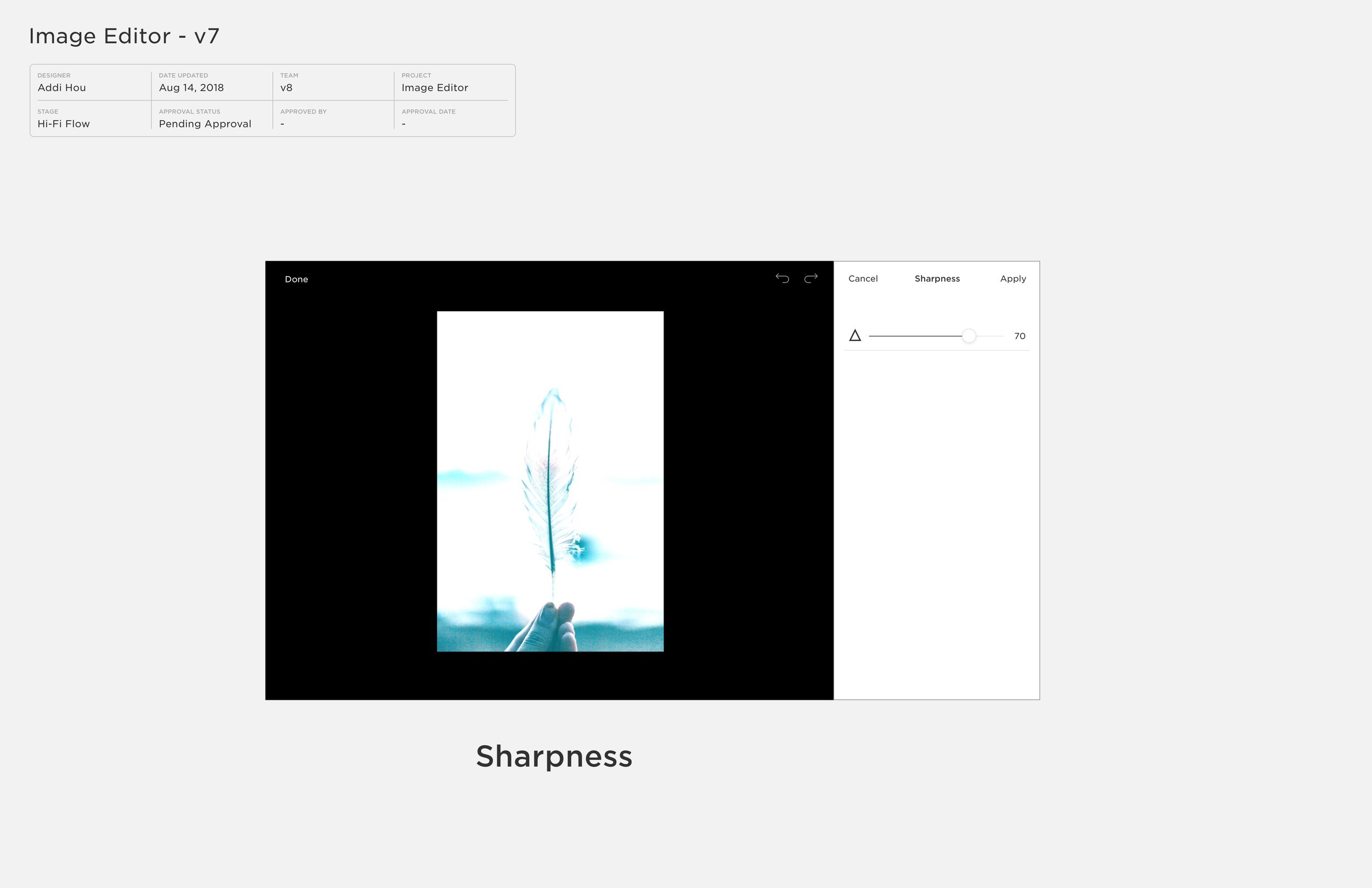
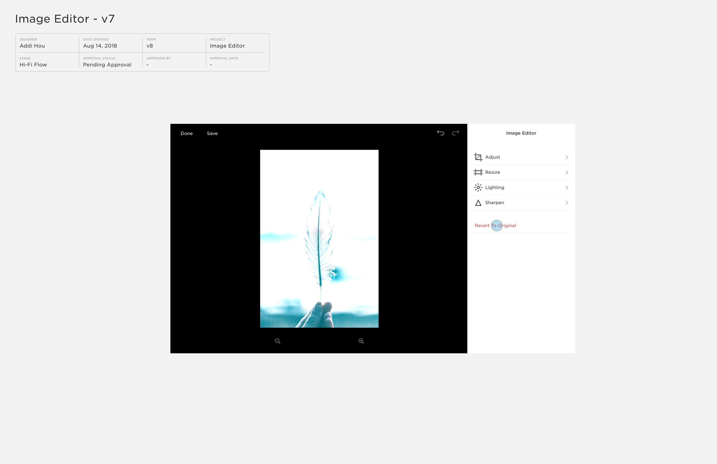
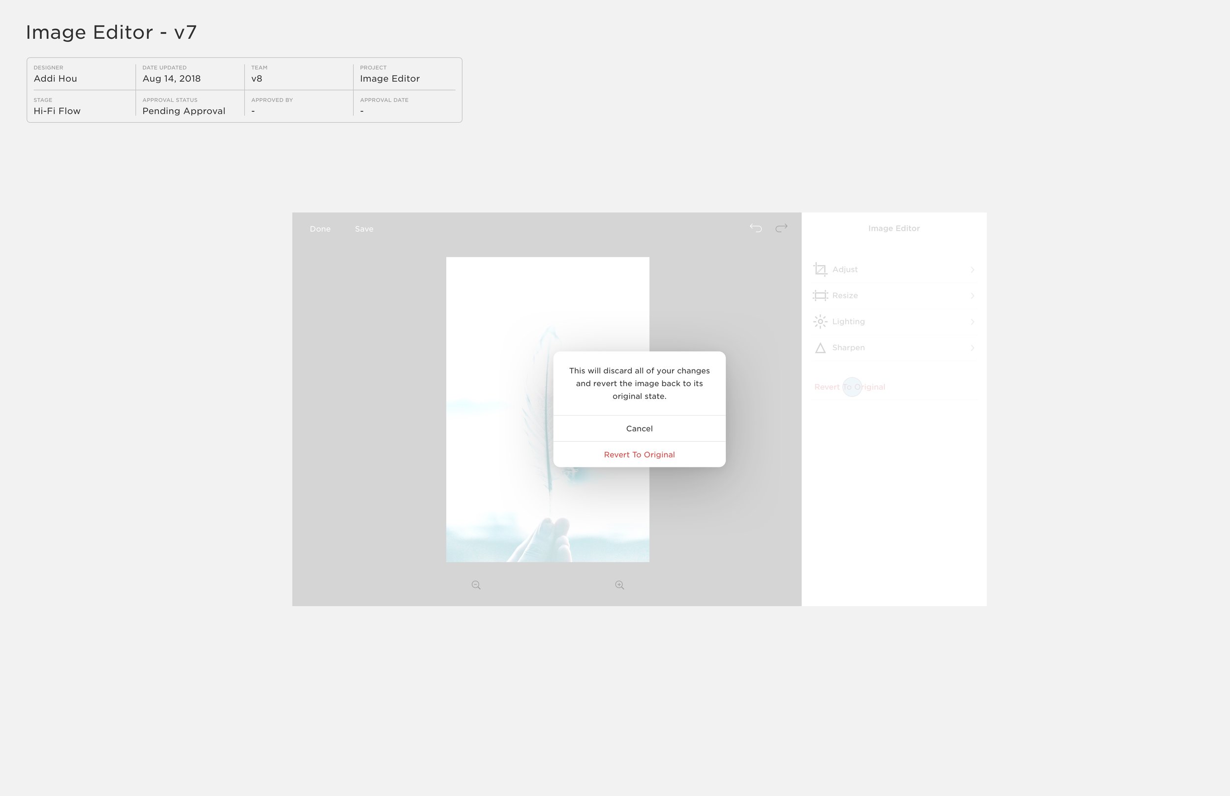
RE-DESIGNING THE IMAGE EDITOR
The existing Aviary image editor was dated, clunky, filled with unwanted features and expiring so the project was urgent. Aviary was also glaringly incongruous visually with the clean modern SQSP aesthetic.
I started with examining each feature on Aviary to determine what the respective functions and flow were. I hoped to minimize anything unnecessary
OLD VS NEW

The final redesigned image editor is stripped down to the core essential functions as opposed to the over-cluttered under-utilized functions of the old Aviary editor.
ANALYSIS
By analyzing data, we were able to determine actual usage by customers of the editing tools.
Regularly testing competitive image editing apps helped determine which specific functions were commonly used and needed.
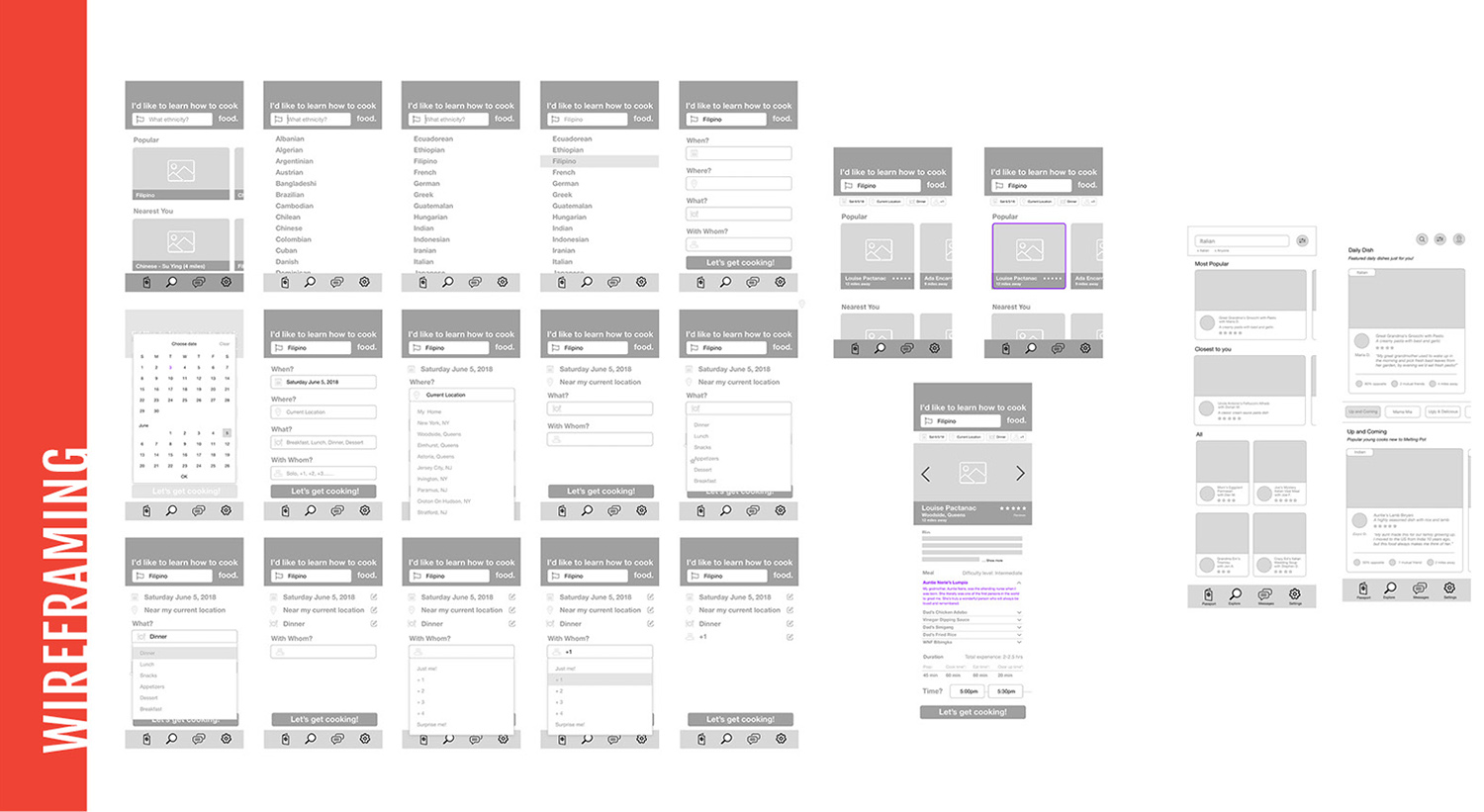
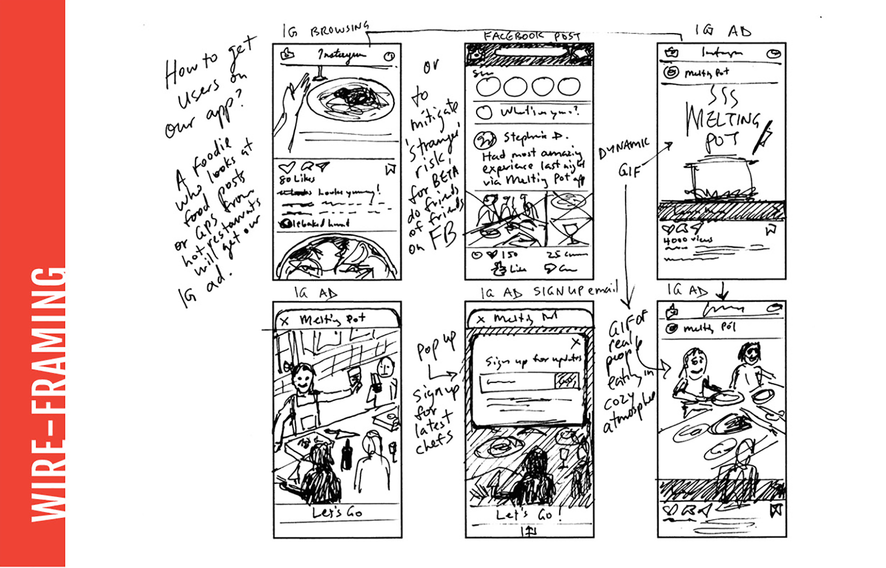
WIREFRAMING
Exploring the UX flow of the old editor helped us transition to a smoother experience.
Having worked on a re-design of the SQSP modal system prior to this project, I was well versed with the design system and started incorporating the new visual language and ratios into the new editor.
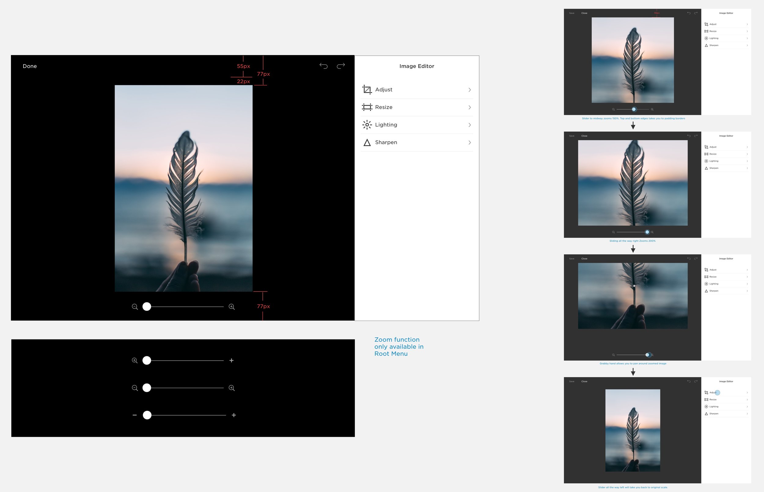
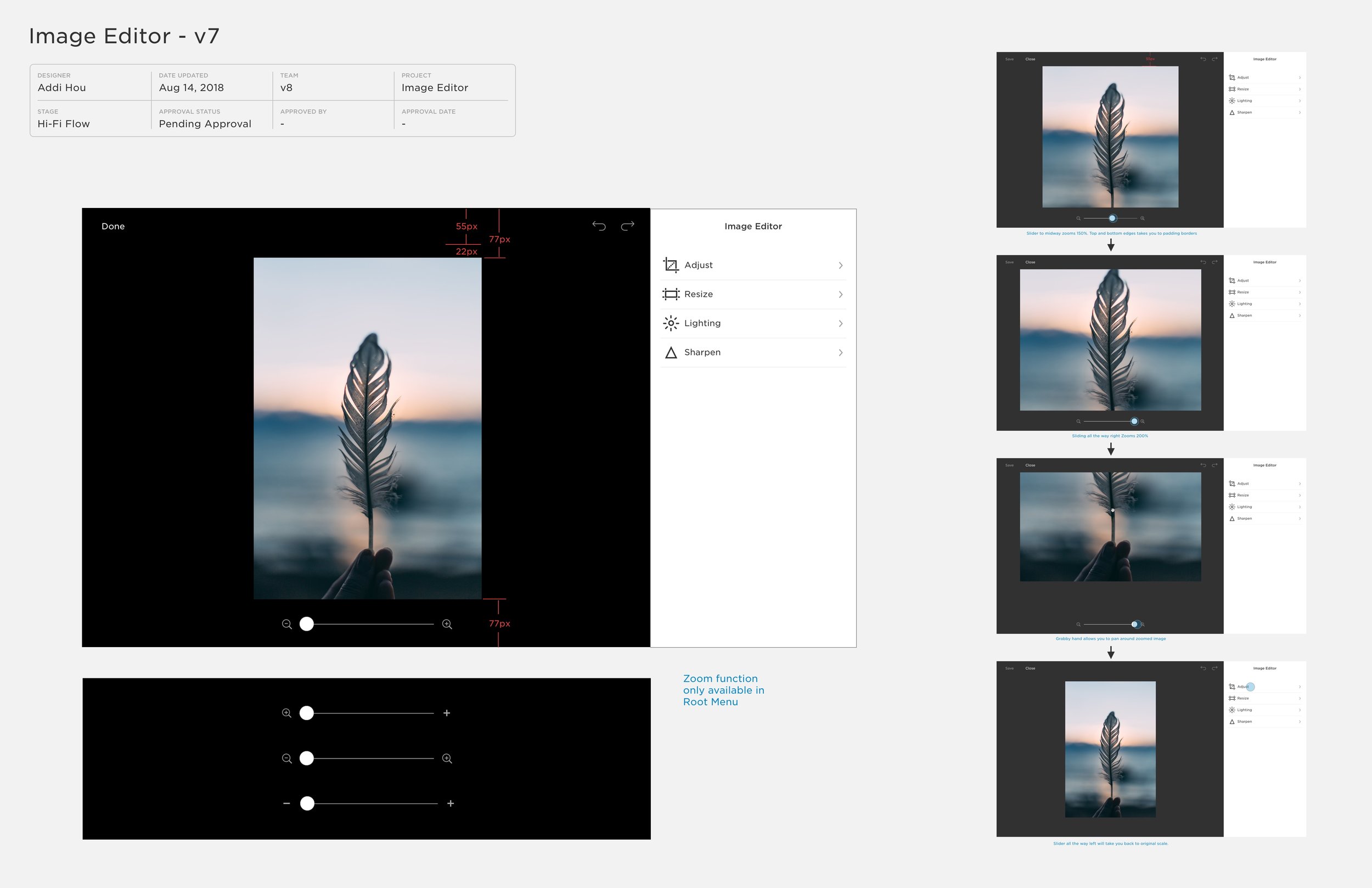
Placing the menu on the right margin aligned with the rest of the SQSP platform and the soon-to-be launched version of the new OS. It also made sense in maximizing usable space
A dark and light mode was proposed to allow user to choose the best contrast to their images, but it was nixed due to developer constraints.
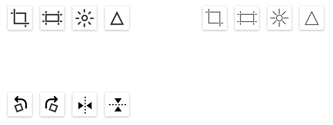
SPECIFIC FUNCTIONS


EXAMINING UX FLOW
Analysis allowed us to delete unnecessary features. Figuring out the overall flow of functions as we edited down was important in user testing.
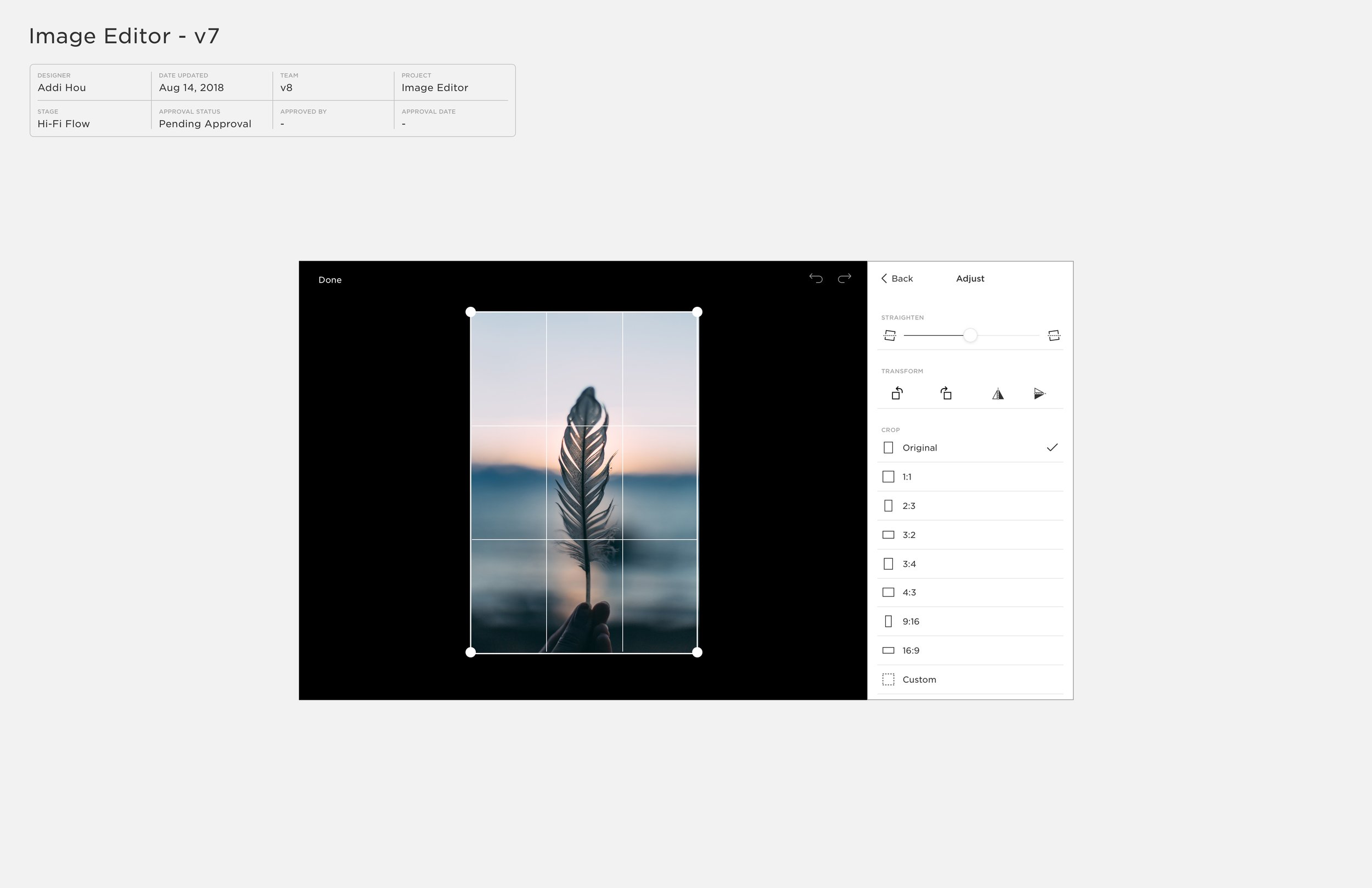
Getting the features down to Transform (crop), Adjust (lighting) and Effects (after more user testing we determined effects could also be deleted from our features), we inched closer to a final result.
Exploration of a feature that would later be edited as we pared down to essentials.
MOBILE EXPLORATIONS
Exploration into how this new design would look in mobile interface
NEW 800px MODAL SYSTEM
There was no set system for the modals used by the various facets of design. The sizes / ratios ran the gamut and lacked cohesion.
Working with the systems designer, I gathered all the assets from the various product design teams and tried various ratios for the modals. We settled on 800px after many iterations and discussions with the teams and design leads.
800 was a number derived from realizing that there were consistent widths of 320 and 480 used throughout the platform. The sum was harmonious.


Trying various ratios based on disparate existing assets throughout the SQSP design universe.


PAGE BADGING
Very simple micro-interaction with icons appearing to inform user of activated levels of navigation.


